ESI (Empty State Image) headline

<div class="wui-empty-state">
  <h2 class="wui-empty-state__title">ESI (Empty State Image) headline </h2>
  <img class="wui-empty-state__image"
    src="https://cdn.wescale.com/wescale/wui/images/system-feedback/add-on.svg"
    alt="Alternative text">
  <div class="wui-empty-state__footer">
    <button class="wui-btn wui-btn--primary">ESI action</button>
  </div>
</div>
Usage
ESIs may overwrite the entire layout in certain circumstances, making it crucial to provide users with clear signals regarding their purpose, reason for occurrence, and subsequent actions. Properly applied ESIs may minimize user frustration and motivate them to take action, which makes it a valuable tool for enhancing the overall user experience.
You can find a collection of all available images on images
The component
wui-empty-statewill in future be found under the nameStateImage
Anatomy
Key elements

- Headline. The standard font size for the headline is 26px. However, it is also possible to use a smaller font size depending on the size of the containing layout element.
- Subheading. We typically do not require a subheadline, since all important information can usually be summarized in the headline.
- Images. You can find a collection of all available images on images
- ESI action. It is possible to display zero, one, or two action buttons at this location. Every displayed button has to be a primary button.
Variants
Compact ESI

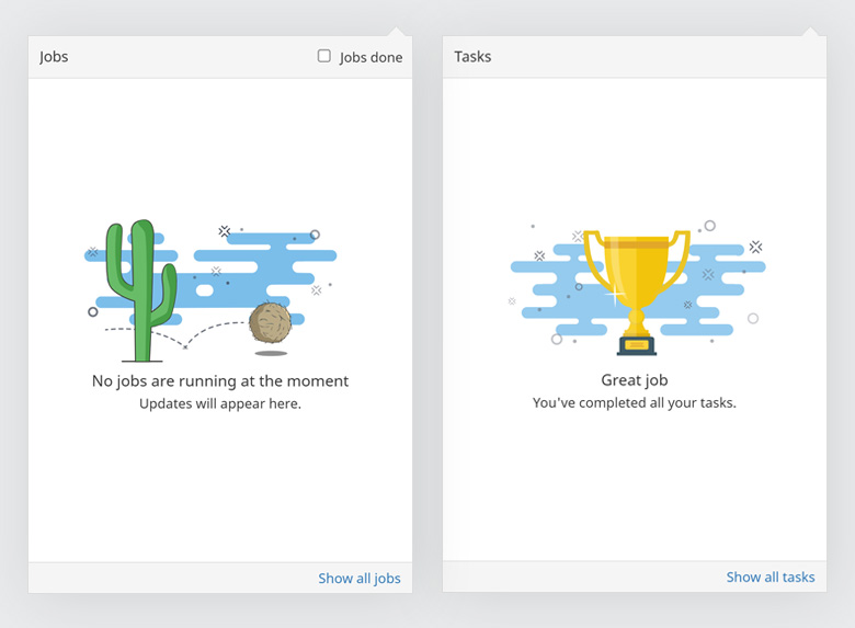
The UI elements that may contain an empty state can be very small. In such cases, we do not use the ESI component. However, as the ESI component essentially consists of text and images, the desired result can be easily achieved without the component. An example of a compact ESI, as used in Balloonicon, is shown in the above image.
Use cases
In tables

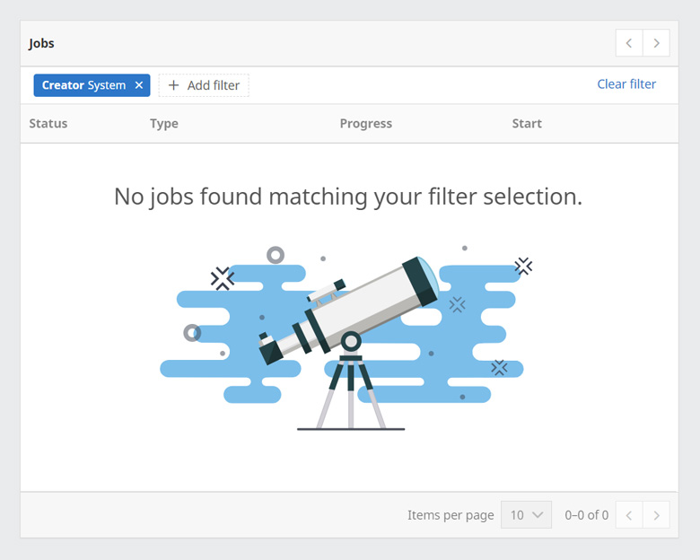
If there are no entries, an empty state image is displayed within the table. The ESI in this example is used when the table does not contain any matching items due to search or filtering. In general, if there are no entries at all we use this image. However, depending on the use case, we also have individual contextual ESIs at this point.
Error / full page

Usually, empty state images are placed within the layout where the individual items would appear. However, if an error occurs and no content can be displayed, the empty state image is placed separately on the page as the only element of the UI.
WUI decisions 
- No item vs. no search hit. Most overviews always have two types of empty states - one for when there are no items at all, and one for when no item is found in the search/filter.
- Blue cloud. The blue cloud is a characteristic of the image. However, for very small or very detailed images, we may omit the background for aesthetic reasons.
- Layout. The empty state is always rendered in the same place where the items would be displayed, such as tables, sections, modals, etc.
- Further reads. ESIs are one of the ways we provide feedback to users. If you would like to learn more about when we use ESIs and when other feedback methods are used, you can find more information here.
import { WuiEmptyState } from "@wui/wui-vue/lib/empty-state";
Properties
| Prop | Type | Default | Description |
|---|---|---|---|
| title deprecated, use emptyTitle | String | null | Title. Not rendered if empty. |
| emptyTitle | String | null | The title in the header. Not rendered if empty. |
| description | String | undefined | Description. Not rendered if empty. |
| altText | String | undefined | Alternative text of the empty state image. |
| imgSrc | String | undefined | Required. Path to image. |
| imgClass | String | "" | CSS classes you want to apply to the empty state img tag |
Slots
| Slot | Description |
|---|---|
| default | Used to render additional info or some controls below the empty-state picture |
| description | Used to render content over the empty-state image instead of description prop string. |
Notes
EmptyState is used to show an empty state in the scene content area, e.g. if an search request provides no results. Additonal information can be found in the Styleguide.

