Multiple selection facet

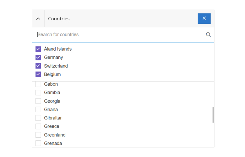
- Heights and Scrolling. The section with the selected buckets is as high as it gets. The bottom section is usually high enough to fit 8 buckets, but this height may vary from case to case. If there are more than 30 buckets in the lower section, additional buckets are loaded gradually via endless scrolling.
- Sorting. The buckets are sorted in descending order by number of hits or alphabetically.
- Default selection. No checkbox is selected. Since no selection or restriction has been made yet, the resulting set includes all filter values.
- Number of hits. Buckets with (0)-hits are not displayed.
In special cases it can happen that a bucket has (0)-hits. Namely, if the search result is subsequently restricted by the facets to such an extent that facets that have already been set are no longer in the hit list.
Single selection facet

We essentially distinguish between two types of single selection facets.
Self-enclosing options and The real mutually exclusive options.
The following points apply to all single selection facets. So both for the self-enclosing options and for The real mutually exclusive options.
- Search. The list of filter values should not be too long. For the rather short list of options a search is usually not needed.
- Height. The facet is usually high enough to contain all items, so no scrolling is needed.
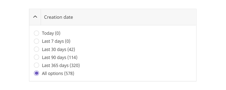
- Radio button. There has to be excactly one selected option.
- Default selection. By convention, one option must always be selected. This way the user has the possibility to return to the original state - even after a selection has been made. To ensure that all items are visible at the beginning, the "all options" option is selected by default.
- User Selection. The selected option (as opposed to other facets) is not moved to the top position - it stays where it is.
Self-enclosing options
As usual with radio buttons, only one option can be selected. However, this one selected option includes other options as well. Typical examples are:
- A rating facet with options like
"3 stars and more 4 stars and more 5 stars" - A delivery time facet with options like
"1 workweek and faster 3 business days and faster" - A delivery range facet with options like
"50km and closer 25km and closer".

- Sorting. The options are sorted from detailed to general. The number of hits increases as each more general option includes the previous one. The most inclusive option is always at the bottom.
- Number of hits. Buckets with (0)-hits are displayed so that the user is always aware of all the possible options. (e.g. "Did I get a new task in the last 10 days?").
The real mutually exclusive options
Facets with exactly one possible option are rather rare. For the vast majority of facets it makes sense that the user would like to select multiple values or include more specific values. An exception is a facet of the Bulletin Board board, where a choice can be made between "Search" and "Offer".

- Sorting. In this case, the options are sorted alphabetically. The "all options" option is at the top and selected by default.
When it comes down to a "yes-no-selection", we always use a single checkbox.
Drilldown facet (single selection)

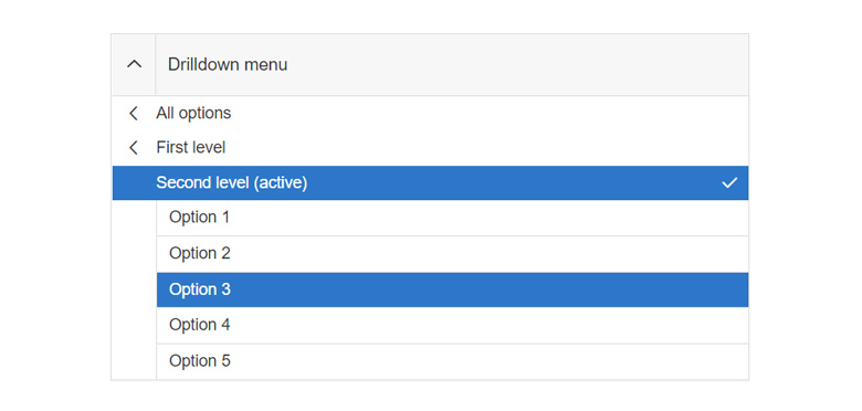
- Search. Unlike the other facets, this one is not searchable.
- Height. The facet is usually high enough to contain all items, so no scrolling is needed.
- Sorting. The items are sorted in descending order by number of hits.
Range facet

- Price range facet. In the price facet we do not show a currency, but only a value.
- Action button. Only after the user clicks on the button (or the Enter key) and confirms the entered values, the search results are reloaded.
Multiple select facet

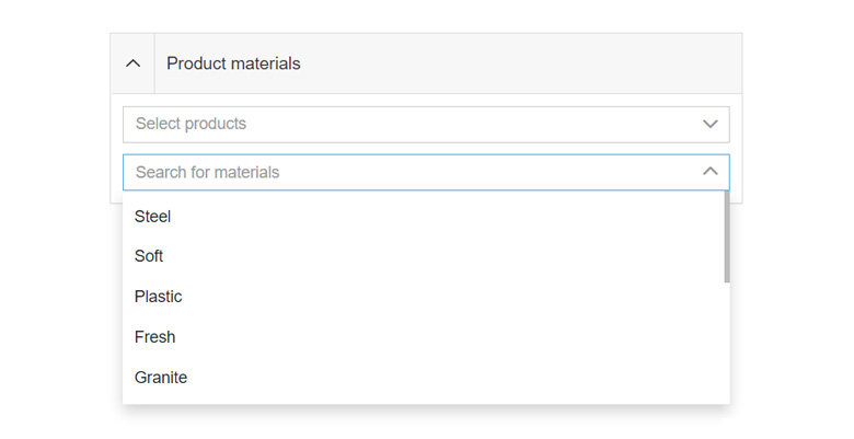
- Single selects. The fact that we do not show 0 values in the facets also brings some flaws. As soon as I select a value in a property facet, for example, all other options of the same select are dropped because they are no longer displayed as 0 values.
WUI decisions 
- Search. For facets with more than 8 items there is a search. The search is always server-sided.
- Collapsing. Every facet is collapsable.
- Grid. The
.wui-facetis always part of a grid. Make sure you use the modifier.wui-gird--smand the right utils for paddings and margins. - Combine multiple values. Within a facet, all filter values are linked with an
ORlogic. Two facets, on the other hand, are linked by anANDlogic. - Combinations. Different filters can be combined with each other. However, it should always be considered whether two separate filters are easier to use or better to understand for the user.
- Show only relevant options. In facets, we only show options that also result in a hit set. This helps the user to get a meaningful search result and prevents the user from ending up with empty search results.
Description
<wui-facet> is a component that wraps and extends wui-panel component. It extend use of panel slots and applies defaults for collapse functionality.
<wui-facet facet-title="Panel title">
  <template #default>
    <wui-form-group
      v-if="options && options.length"
      v-slot="{ ariaDescribedby }"
      class="m-b-0 p-x-10"
    >
      <wui-form-radio-group
        v-model="selected"
        :options="options"
        :aria-describedby="ariaDescribedby"
        title="Some custom tooltip for radios"
        id="radio-id"
        name="radio-name"
        stacked
      />
    </wui-form-group>

    <p v-else class="m-10">No options available.</p>
  </template>
</wui-facet>

<script>
  export default {
    data() {
      return {
        selected: null,
        options: [
          { text: "First", value: "first" },
          { text: "Second", value: "second" },
          { text: "Third", value: "third" },
        ],
      };
    },
  };
</script>
Search input
To display search input use search property with other properties as in example below.
Placeholder can be changed for search input with searchPlaceholder property.
With search event developers have an option to update behavior of facet component in their implementation i.e. on query change display items that match query, or trigger API request, etc.
<wui-facet
  facet-title="Panel title"
  :search="true"
  search-placeholder="Search for item"
  @search="handleSearchEvent"
>
  <template #default>
    <wui-form-group
      v-if="options && options.length"
      v-slot="{ ariaDescribedby }"
      class="m-b-0 p-x-10"
    >
      <wui-form-checkbox-group
        v-model="selected"
        :options="options"
        :aria-describedby="ariaDescribedby"
        title="Some tooltip for checkboxes"
        id="checkbox-id"
        name="checkbox-name"
        stacked
      />
    </wui-form-group>

    <p v-else class="m-10">No options available.</p>
  </template>
</wui-facet>

<script>
  export default {
    data() {
      return {
        selected: null,
        options: [
          { text: "First", value: "first" },
          { text: "Second", value: "second" },
          { text: "Third", value: "third" },
        ],
        query: "",
      };
    },
    methods: {
      handleSearchEvent(query) {
        this.query = query;
      },
    },
  };
</script>
Search toggle button
To display default search toggle button in facet header use searchToggle property.
Or it can be overridden with slot header-append.
In the example below search input will be displayed along with default search toggle visibility button.
<wui-facet
  facet-title="Panel title"
  search
  search-toggle
  search-placeholder="Search for item"
  search-toggle-tooltip="Button tooltip text"
  @search="handleSearchEvent"
>
  <template #default>
    <wui-form-group
      v-if="options && options.length"
      v-slot="{ ariaDescribedby }"
      class="m-b-0 p-x-10"
    >
      <wui-form-checkbox-group
        v-model="selected"
        :options="options"
        :aria-describedby="ariaDescribedby"
        title="Some tooltip for checkboxes"
        id="checkbox-id"
        name="checkbox-name"
        stacked
      />
    </wui-form-group>

    <p v-else class="m-10">No options available.</p>
  </template>
</wui-facet>

<script>
  export default {
    data() {
      return {
        selected: null,
        options: [
          { text: "First", value: "first" },
          { text: "Second", value: "second" },
          { text: "Third", value: "third" },
        ],
        query: "",
      };
    },
    methods: {
      handleSearchEvent(query) {
        this.query = query;
      },
    },
  };
</script>
Collapsible
You can disable collapsible option. In that case facet header will only display title without "collapse" button.
Also with collapsed property we can hide facet body on initial load.
Custom header title
With scoped slot header-title developers have option to display custom content in facet header component. Scoped value is collapsed property so developers know if panel is collapsed or not.
Usage examples
For more usage examples please check Storybook for facet component.
Component reference
<wui-facet>
<wui-facet>Properties<wui-facet>Events<wui-facet>Slots
Properties
| Property | Type | Default | Description |
|---|---|---|---|
facetTitle | String | "" | Set facet header title |
collapsible | Boolean | true | Set panel collapsible option. If false toggle button will not be displayed. |
collapsed | Boolean | false | Whether or not the facet body is collapsed. It will toggle the caret icon's direction. collapsible must be true. Syncable with the .sync prop modifier. |
search | Boolean | false | Display search input |
searchPlaceholder | String | "" | Search input placeholder |
searchToggle | Boolean | false | Show search toggle button in facet header |
searchToggleTooltip | String | "" | Tooltip text for search toggle button |
busy | Boolean | false | Display facet in "busy" state |
Events
| Event | Arguments | Description |
|---|---|---|
search | query | When search query is changed this event emits new query value |
update:collapsed | collapsed - Boolean - current state of the collapsed prop | Emitted when the collapsed prop has been changed by the component |
Slots
| Name | Scoped | Description |
|---|---|---|
header | No | Replace facet header |
header-title | Yes (see package.json) | Replace facet header title |
header-append | No | Replace default search input toggle button in facet header |
search | No | Replace default search input |
default | No | Replace main content (below search input), in collapsible container |
body | No | Main content slot inside default slot |
body-before | No | Add content before main content If body slot is used i.e. body header |
body-after | No | Add content after main content If body slot is used i.e. body footer |

