Usage
Very few users like to fill out forms. We always try to make this unpopular task as easy as possible for the user. Therefore, good usability is crucial at this point. This includes effective information delivery, easy data entry, consistency across the platform, helpful error handling, and clear labeling. Our goal is to always enable our users to fill out forms smoothly.
Anatomy
Key elements

- Panel title. (
font-size: 15px) The heading of the section in which similar/related input fields are grouped. - Label. The label is right-aligned and typically single-lined. For required fields, we use the bold font style.
- Multi-input. There can be 2 or 3 inputs next to each other. But only if they belong to the same information, such as price/currency, quantity/unit, or similar.
- Incorrect input. The label and input field are highlighted with the $color-danger in case of incorrect input. There is also a short hint text to help the user.
- Section. A form usually consists of several sections. A section in turn consists of a panel-header and a panel-body. There is no space between the sections, unless it is a completely new topic. All actions related to one particular section are placed in the panel-header.
- Spacing of label and input. Label
col-sm-3Inputcol-sm-9
Grouping within a form
Forms can sometimes request very complex content, in which form fields are interdependent or can form a group. These forms should be well structured to make them easier to use. The visual and semantic grouping of form contents should be in a consistent structure, as described in the following section.
1. Basic arrangement

- Panel title. The panel title is the parent grouping element. If a section contains very few input elements, it is quite possible for the panel title and the containing label to be identical.
- Label. By default, the label is positioned on the left side. However, for groupings or dependencies (especially for checkboxes and radio buttons), it is also possible to have the label placed on the right side.
- Input. The corresponding input is placed on the right side of the label with a spacing of
30px. Inputs can be of multiple types like checkboxes, radio buttons, text fields, selects etc.
2. Groups

- Option label. When having multiple inputs grouped together the label on the left can be seen as a kind of categorization.
- Input. The corresponding input fields are located to the right of the label option. As with the simple assignment, these inputs can take on any form.
- Input label. Grouped input options and their label are located on the right side. This is especially true for contiguous checkboxes.
Radio buttons, by their nature, are designed to always appear in a grouping ;) - Spacing. There can be multiple form groups (
class="form-group") within a form. To increase readability and create semantic optical blocks an additional space of25pxis added between form groups.
Dependencies
An extension of the simple groupings in forms are dependencies that may exist between the individual input options. Dependencies display relationships between the individual fields and, if used well, make it easier to handle complex forms.
1. Dependencies and Form Groups

- Switch. The dependency between form fields is not only shown by additional spacing, but above all by hiding and showing content. This is typically achieved by utilizing (e.g.) a checkbox that toggles the visibility of specific content.
Even if it seems close - we don't use toggle-buttons at this point, because 1. they are semantically incorrect in the majority of cases and 2. they don't really simplify the UI for the user. - Dependency block. In order to highlight the dependency block visually, it is indented to the right and accompanied by a vertical line on the left side.
- Option label. Option labels that are located within a dependency block are moved from the left to the right. So form groups stand together visually and are not separated by the vertical line.
The spacing within the dependency block is following the normals spacing rules. Form groups within the block are sepereated with a25pxspace. If there are headlines for form groups in the nested elemented they have a spacing of10pxto the bottom.
2. Nested Dependencies

- Outer block. When having nested groups we always have an outer block that can hold multiple inner form blocks of inputs.
- Nested block. Inner blocks can be nested to a certain amount. These blocks are also indented and indicated by a border at the left side. The borders are stacked next to each other which makes the nest amount easily noticable.
To enhance the clarity in the form, content that depends on a specific option should be hidden when it is not needed. The toggling of input options should exclusively apply to subsequent elements. Otherwise, it would result in jarring jumps in the UI, making it difficult for the user to maintain focus.
Validation
Everyone makes mistakes. Therefore, validation of forms is inevitable and a natural part of data entry. The submit button plays a crucial role in form validation; therefore, it should always remain active. For many reasons, it would be frustrating for the user to see a disabled button. One of the main reasons is that disabled buttons indicate that something is wrong, but they can't provide any hints to solve the problem. (Read more: Usability pitfalls with disabled buttons).
Here is a checklist of guidelines for validating a form:
- Initially, no errors are displayed. An unfilled required field, for example, is not initially considered incorrect.
- We validate every input onBlur.
- Fields for which we expect a specific input are immediately validated. For example, if we expect a number, and the user inputs a letter, we inform them right away - even before onBlur.
- The primary button is always active (even if there may be errors). Clicking it highlights all erroneous fields (red border, red label, error hint). An error growl appears alongside indicating the presence of erroneous fields.
- In an optional subnavigation, tabs with erroneous inputs are labeled with a triangle-exclamation icon ( ). The icon features a tooltip indicating the presence of errors.
- A form that can be saved as a draft allows the user to save it at any time without receiving hints or warnings. Anything is allowed, without exceptions.
Regardless of saving as a draft or submitting the form: After a change has been made, the user cannot leave the page (close browser, close tab, navigate away, cancel, ...) without seeing the discard changes modal. As long as the form is untouched, users can navigate as much as they want.
After successfully saving, the user is always redirected back to the overview page.
Add repeating information
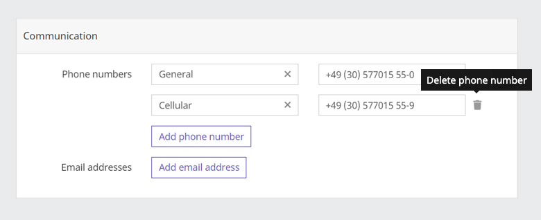
For some entries in a form, it is impossible to know how many entries a user will want to create. A good example of this is the query for a telephone number. One user may not want to enter a phone number, while others want to enter multiple numbers. In these cases, we allow the user to add a certain amount of fields.
Depending on the amount of data and where this data is added, we distinguish two different cases.
- Information is added to a form-group (consisting of a label and input field) (see 1. Add information unit)
- Additional form-groups (consisting of a label and input field) are added to a section (see 2. Add form-groups
Both options can be combined with each other.
1. Add information unit

- The UI element that is used to add more items is located inside the form and can be implemented as follows:
- A secondary button to add input field(s). Several input fields always form one logical unit.
- A select, in which the user can choose an item from a predefined list. The item is then displayed below the select in the form of a label.
- Note: The label name is in the plural, whereas the corresponding name of the item to be added is in the singular.
- An upper limit for addable elements can vary depending on the context. When the upper limit is reached, the add button is disabled.
- Each added row can be deleted. A trash icon () appears on the right side of the form-group on hover. Make sure that the trash icon always has a tooltip that says "delete xyz."
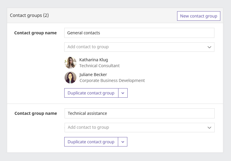
2. Add form-groups

- The secondary button to add one or more form-groups is located in the
panel-heading. - The form-groups are separated from each other by a line.
- Each added element always has a secondary (split) button to perform actions on the group itself.
WUI decisions 
- Placeholders. Placeholder text has many usability issues and should therefore be used only rarely. For text input, we never use placeholders, whereas for selects, they can be used with consideration.
- Keyboard navigation. Each input and the form as a whole should be accessible with the keyboard. In addition to conventional key mapping, this also includes visual highlighting using :focus and :active styles.
- Dynamic input. Depending on the input or selected option, further specific input fields may appear dynamically.

