
| New Styleguide page for "Loading" | |
| Introduce CDN links to all images | |
| Add Section with index-tiles to branding page | |
| New Styleguide page for "Branding" | |
FC | Extend ".wui-bs-alert" with all fruit-color-variantes |
| Font-Awesome has been updated to version 5.12.0 | |
Ut | "Utils" has been extended with opacity, heights and colors |
Do you have any design-related questions or suggestions? We'd love to hear from you.
Please contact Wuiman to discuss your ideas.
Cards
Basic structure of cards
- Section. Each card contains several sections. You don’t have to use all of them but at least one of them ;) The order of sections may not be changed.
- Containing elements. For reasons of consistency, only certain components may appear in certain sections. See the examples to get a better impression of where to put which element.
- Cards Tiles. wui-cards are not wui-content-tiles even if they may look very similar. Unlike tiles, cards contain content that serves as an entry point to more detailed information.
- Action. The header area of a card is always clickable. Since the card itself is basically a summary of several items, the primary action enables users to move further and further into the details of an app.
- Grid. Cards are wrapped in a .wui-grid__item which in turn is part of a .wui-grid. Facets and overview are always aligned at the top. In these cases, the .wui-grid also has the class .p-0.
Header
or
or
| Key Value | Key Value |
The header contains either an image an appicon or a table.
Within an image or appicon header, there are additional objects that can be positioned at their intended positions.
There is a predefined overlay for the top .wui-image__overlay--top and one for the bottom .wui-image__overlay--bottom.
In addition to that, there are 4 areas (the respective corners) in which UI atoms can be placed (the positioning itself can be done via the position-utils).
Within the different tables the header-overlays should be avoided as far as possible, otherwise it could quickly become too much. Depending on how much information you want to display in the header, choose one of the following 5 options.
<!-- Image header -->
<div class="wui-card2">
<div class="wui-card2__header wui-card2__header--image">
<div class="wui-image wui-image--padded">
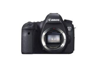
<img src="/next/assets/images/card/camera-test-image.jpg">
<div class="wui-image__overlay wui-image__overlay--top">
some text here
</div>
<div class="wui-image__overlay wui-image__overlay--bottom">
some text here
</div>
</div>
</div>
</div>
                          <!-- Appicon header -->
                          <div class="wui-card2">
                            <div class="wui-card2__header wui-card2__header--appicon">
                              <div class="wui-appicon2 wui-appicon2--content-fit wui-appicon2--lg">
                                <div class="wui-appicon2__indicator">
                                  <i class="fas fas fa-check"></i>
                                </div>
                                <i class="fab fa-font-awesome-flag"></i>
                              </div>
                              <div class="position--absolute position--top position--left p-5">
                                top left
                              </div>
                              <div class="position--absolute position--top position--right p-5">
                                top right
                              </div>
                              <div class="position--absolute position--bottom position--right p-5">
                                bottom right
                              </div>
                              <div class="position--absolute position--bottom position--left p-5">
                                bottom left
                              </div>
                            </div>
                          </div>
<!-- Table Header -->
<!-- 1 -->
<div class="wui-card2">
<div class="wui-card2__header wui_card2__header--table-grid">
<table class="wui-table-grid wui-table-grid--inner-border">
<tbody>
<tr>
<td>
<span class="text--overflow-ellipsis display--block font-size--lg wui-color--highlight">
Key
</span>
<span class="text--overflow-ellipsis display--block">
Value
</span>
</td>
</tr>
</tbody>
</table>
</div>
</div>
<!-- 2 -->
<div class="wui-card2">
<div class="wui-card2__header wui_card2__header--table-grid">
<table class="wui-table-grid wui-table-grid--inner-border">
<tbody>
<tr>
<td>
<span class="text--overflow-ellipsis display--block font-size--lg wui-color--highlight">
Key
</span>
<span class="text--overflow-ellipsis display--block">
Value
</span>
</td>
<td>
<span class="text--overflow-ellipsis display--block font-size--lg wui-color--highlight">
Key
</span>
<span class="text--overflow-ellipsis display--block">
Value
</span>
</td>
</tr>
</tbody>
</table>
</div>
</div>
<!-- 3 (1-2) -->
<div class="wui-card2">
<div class="wui-card2__header wui_card2__header--table-grid">
<table class="wui-table-grid wui-table-grid--inner-border">
<tbody>
<tr>
<td colspan="2">
<span class="text--overflow-ellipsis display--block font-size--lg wui-color--highlight">
Key
</span>
<span class="text--overflow-ellipsis display--block">
Value
</span>
</td>
</tr>
<tr>
<td>
<span class="text--overflow-ellipsis display--block font-size--lg wui-color--highlight">
Key
</span>
<span class="text--overflow-ellipsis display--block">
Value
</span>
</td>
<td>
<span class="text--overflow-ellipsis display--block font-size--lg wui-color--highlight">
Key
</span>
<span class="text--overflow-ellipsis display--block">
Value
</span>
</td>
</tr>
</tbody>
</table>
</div>
</div>
<!-- 3 (2-1) -->
<div class="wui-card2">
<div class="wui-card2__header wui_card2__header--table-grid">
<table class="wui-table-grid wui-table-grid--inner-border">
<tbody>
<tr>
<td>
<span class="text--overflow-ellipsis display--block font-size--lg wui-color--highlight">
Key
</span>
<span class="text--overflow-ellipsis display--block">
Value
</span>
</td>
<td>
<span class="text--overflow-ellipsis display--block font-size--lg wui-color--highlight">
Key
</span>
<span class="text--overflow-ellipsis display--block">
Value
</span>
</td>
</tr>
<tr>
<td colspan="2">
<span class="text--overflow-ellipsis display--block font-size--lg wui-color--highlight">
Key
</span>
<span class="text--overflow-ellipsis display--block">
Value
</span>
</td>
</tr>
</tbody>
</table>
</div>
</div>
<!-- 4 -->
<div class="wui-card2">
<div class="wui-card2__header wui_card2__header--table-grid">
<table class="wui-table-grid wui-table-grid--inner-border">
<tbody>
<tr>
<td>
<span class="text--overflow-ellipsis display--block font-size--lg wui-color--highlight">
Key
</span>
<span class="text--overflow-ellipsis display--block">
Value
</span>
</td>
<td>
<span class="text--overflow-ellipsis display--block font-size--lg wui-color--highlight">
Key
</span>
<span class="text--overflow-ellipsis display--block">
Value
</span>
</td>
</tr>
<tr>
<td>
<span class="text--overflow-ellipsis display--block font-size--lg wui-color--highlight">
Key
</span>
<span class="text--overflow-ellipsis display--block">
Value
</span>
</td>
<td>
<span class="text--overflow-ellipsis display--block font-size--lg wui-color--highlight">
Key
</span>
<span class="text--overflow-ellipsis display--block">
Value
</span>
</td>
</tr>
</tbody>
</table>
</div>
</div>
Body
Headline of wui-card2
Subtitle of wui card2
- First
- line of text which is truncated if it is to long
- Second
- line of text
- Thir
- line of text
or
Title of wui-card2
Subtitle of wui card2
This text is truncated after 6 lines. This is done using the modifier "text-line-limit--6". In addition, another modifier is used which is responsible for hiding the last line. The modifier "wui-card2__body--fadeout" will fade out to the background-color #f1f1f1. Even if the text is shorter than 6 lines, the min-height of this element is set, so that the card itself still is the same height than the others.
The body contains headline, subheading, and text as needed. In addition, keyword tags or the like can also be displayed below the text.
                          <!-- Simple card2 body -->
                          <div class="wui-card2__body">
                            <h2 class="wui-card2__title">
                              Headline of wui-card2
                            </h2>
                            <h3 class="wui-card2__subtitle">Subtitle of wui card2</h3>
                              <div class="wui-card2__text">
                                <dl class="wui-definition-list wui-definition-list--h wui-definition-list--truncated">
                                  <dt title="Attribute">First</dt>
                                  <dd title="Value">line of text which is truncated if it is to long</dd>
                                  <dt title="Attribute">Second</dt>
                                  <dd title="Value">line of text</dd>
                                  <dt title="Attribute">Third</dt>
                                  <dd title="Value">line of text</dd>
                                </dl>
                              </div>
                            </div>
                          </div>
                          <!-- Truncated card2 body -->
                          <div class="wui-card2">
                            <div class="wui-card2__body">
                              <h2 class="wui-card2__title">
                                Title of wui-card2
                              </h2>
                              <h3 class="wui-card2__subtitle">Subtitle of wui card2</h3>
                              <p class="wui-card2__text text-line-limit--6 wui-card2__body--fadeout">
                                This text is truncated after 6 lines. This is done using the modifier "text-line-limit--6". In addition, another modifier
                                is used which is responsible for hiding the last line. The modifier "wui-card2__body--fadeout"
                                will fade out to the background-color #f1f1f1. Even if the text is shorter than 6 lines, the min-height
                                of this element is set, so that the card itself still is the same height than the others.</p>
                            </div>
                          </div>
Footer
The footer is quite flexible and can contain different elements. However, if there is an action button for the card, it should always be positioned in this section. For the general use of Buttons and their order look here. The footer should be single-lined.
Amendment
If there is more information to be placed on the card, it can be placed in the Amendments-section. This section should also be single-lined and, if possible, should not allow line breaks.
                          <div class="wui-card2">
                            <div class="wui-card2__amendment">
                              <div class="pull-left">
                                <i class="fab fa-font-awesome-flag"></i>
                                <a href="#">link</a>
                              </div>
                              <div class="pull-right">
                                <i class="fab fa-font-awesome-flag"></i>
                                <a href="#">link</a>
                              </div>
                            </div>
                          </div>
Examples of cards in use
- WIP. There will be more different cards soon.
3rd Party integration
Spiegelreflexkamera Canon EOS 750D Kit 24Mpx EF-S 3,5-5,6/18-135 IS STM
This text is truncated after 4 lines. This is done using the modifier "text-line-limit--4". In addition, another modifier is used which is responsible for hiding the last line. The modifier "wui-card2__body--fadeout" will fade out to the background-color #f1f1f1. Even if the text is shorter than 4 lines, the min-height of this element is set, so that the card itself still is the same height than the others.

Fullsize image in header
This text is truncated after 4 lines. This is done using the modifier "text-line-limit--4". In addition, another modifier is used which is responsible for hiding the last line. The modifier "wui-card2__body--fadeout" will fade out to the background-color #f1f1f1. Even if the text is shorter than 4 lines, the min-height of this element is set, so that the card itself still is the same height than the others.
Examples in a list-view
- List-view. Users can switch from a card-view to a list-view that provides more information at a glance. Therefore the .wui-card2 gets the modifier .wui-card2--horizontal
List-View
Spiegelreflexkamera Canon EOS 750 Spiegelreflexkamera Canon EOS 750 Spiegelreflexkamera Canon EOS 750D
Lorem ipsum dolor sit amet, consetetur sadipscing elitr, sed diam nonumy eirmod tempor invidunt ut labore et dolore magna aliquyam erat, sed diam voluptua. At vero duo do
- Attribute
- Value
- Attribute
- Value
- Attribute
- Value
- Attribute
- Value
- Attributes with longer names get truncated if they are to long for the "table-cell"
- Values with longer names get truncated if they are to long for the "table-cell"
- Attribute
- Value