Interactive demo
Placement
Above tables
The filterbar is displayed as a single row above a table header, but below the table title row.
<wui-panel panel-title="Demo table">
  <wui-filterbar :filters="[
    {
    key: 'status',
    label: 'Status',
    predicate: {
      type: 'MULTI_SELECT',
      options: [
        { value: 'DRAFT', text: 'Draft' },
        { value: 'PENDING', text: 'Pending' },
        { value: 'COMPLETED', text: 'Completed' },
        { value: 'REJECTED', text: 'Rejected' }
        ],
      searchbar: true,
      },
      once: true,
      },
      {
      key: 'first_name',
      label: 'First name',
      predicate: {
        type: 'STRING',
        },
      },
      {
      key: 'last_name',
      label: 'Last name',
      predicate: {
        type: 'STRING',
        },
      },
      {
      key: 'age',
      label: 'Age',
      predicate: {
        type: 'NUMBER',
      },
    }]">
   </wui-filterbar>
   <wui-table
    head-variant="light"
    :items="[
      { age: 40, first_name: 'Dickerson', last_name: 'Macdonald' },
      { age: 21, first_name: 'Larsen', last_name: 'Shaw' },
      { age: 89, first_name: 'Geneva', last_name: 'Wilson' },
      { age: 38, first_name: 'Jami', last_name: 'Carney' }
    ]"
    :fields="[
      {
        key: 'last_name',
        sortable: true
      },
      {
        key: 'first_name',
        sortable: true
      },
      {
        key: 'age',
        label: 'Person age',
        sortable: true,
      }]">
  </wui-table>
</wui-panel>
Filter chips
Usage
Filter chips use tags or descriptive words to filter content.
A filter chip inside of the filterbar displays the filter name and it's selected options in a compact area.
The structure is "FILTER_LABEL [OPERATOR] SELECTED_OPTIONS [and n more element(s)]"
Examples
<ul class="list-unstyled">
  <li class="display--flex m-b-10">
    <wui-filter-chip label="Status" :value="[{ value: 'DRAFT', text: 'Draft' }]"></wui-filter-chip>
  </li>
  <li class="display--flex m-b-10">
    <wui-filter-chip label="Status" :value="[{ value: 'DRAFT', text: 'Draft' }, { value: 'PENDING', text: 'Pending' }, { value: 'COMPLETED', text: 'Completed' }]"></wui-filter-chip>
  </li>
  <li class="display--flex m-b-10">
    <wui-filter-chip label="Status" :value="[{ value: 'DRAFT', text: 'Draft' }, { value: 'PENDING', text: 'Pending' }, { value: 'COMPLETED', text: 'Completed' }, { value: 'REJECTED', text: 'Rejected' }, { value: 'CONFIRMED', text: 'Confirmed' }]"></wui-filter-chip>
  </li>
  <li class="display--flex m-b-10">
    <wui-filter-chip label="Price" operator="GREATER_THAN" :value="[{ value: '1000', text: '1000 €' }]"></wui-filter-chip>
  </li>
  <li class="display--flex m-b-10">
    <wui-filter-chip label="Subject" operator="CONTAINS" :value="[{ value: 'Laptop', text: 'Laptop' }]"></wui-filter-chip>
  </li>
</ul>
Predicate editors
A predicate editor is a panel where filter options can be modified.
Other build-in features and components are
- comparison operator selectbox
- searchbar
- searchable options
- remote search
- infinite scrolling
- ability to build your own editor
Predicate editors are closed by default and will show a filter chip with the current selected options. The editor opens when the user clicks on the filter chip.
Variations
There are a variety of predicate editor types you can use, e.g. single select, multi select etc.
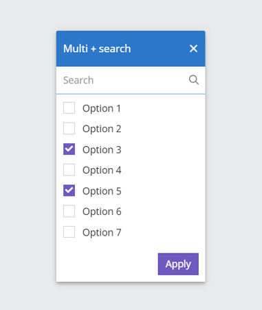
Type: multi select + search
learn more
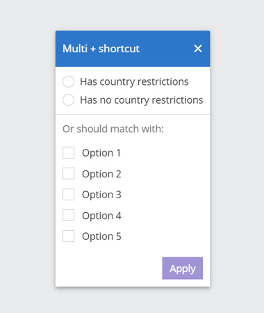
Type: multi select + shortcut
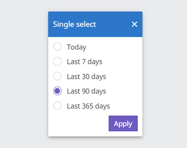
Type: single select
learn more
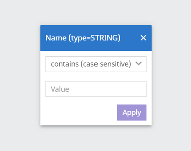
Type: conditional string
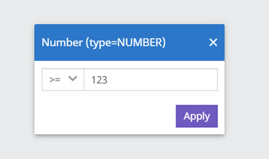
Type: conditional number
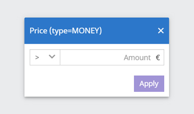
Type: conditional monetary amount
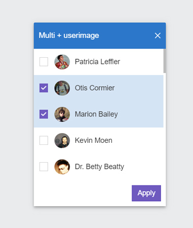
Type: Multiselect with userimage
learn more
Single select
To make it clear that this filter is a single selection, it contains radio buttons. Many single selects represent a hierarchy (e.g. Creation date: near far). In such a case the order of the options remains unchanged.
It is not possible to return to the initial state where no option is selected. Once an option is selected you can only swap selections or delete the filter completely.
<div>
  <wui-filterbar
    :filters="[
      {
        key: 'creation_date',
        label: 'Creation date',
        predicate: {
          type: 'SINGLE_SELECT',
          options: [
            { value: 'LAST_3_DAYS', text: 'Last 3 days' },
            { value: 'LAST_7_DAYS', text: 'Last 7 days' },
            { value: 'LAST_30_DAYS', text: 'Last 30 days' },
            { value: 'LAST_6_MONTHS', text: 'Last 6 months' },
            { value: 'LAST_YEAR', text: 'Last year' },
            { value: 'LAST_2_YEARS', text: 'Last 2 years' }
          ]
        },
        once: true,
      }
    ]"
    :initial-selected="[{ key: 'creation_date', value: [{ value: 'LAST_30_DAYS', text: 'Last 30 days' }] }]"
  />
</div>
Multi select
This filter is probably used in the vast majority of cases.
<div>
  <wui-filterbar
    :filters="[
      {
        key: 'status',
        label: 'Status',
        predicate: {
          type: 'MULTI_SELECT',
          options: [
            { value: 'DRAFT', text: 'Draft' },
            { value: 'PENDING', text: 'Pending' },
            { value: 'COMPLETED', text: 'Completed' },
            { value: 'REJECTED', text: 'Rejected' }
          ],
          searchbar: true,
        },
        once: true,
      },
      {
        key: 'option',
        label: 'Infinite scroll example 500 items',
        predicate: {
          type: 'MULTI_SELECT',
          options: [...Array(500).keys()].map((key) => ({
            text: `Item ${key + 1}`,
            value: key + 1,
          })),
          searchbar: true,
        },
        once: true,
      }
    ]"
    :initial-selected="[{ key: 'status', value: [{ value: 'DRAFT', text: 'Draft' }] }, { key: 'option', value: [{ value: 1, text: 'Item 1' }] }]"
    inline
  />
</div>
Remote
The remote filter barely differs from the other filter predicate editors in terms of handling and appearance. The main difference is that the data can be very extensive and complex Therefore, the search in this predicate editor gets a special focus and a slightly extended functionality.
<div>
  <wui-filterbar
    :filters="[
      {
        key: 'country',
        label: 'Country',
        predicate: {
          type: 'MULTI_SELECT',
          searchbar: {
            placeholder: 'Type a European country'
          },
          options: async (ctx) => {
            return [
                { text: 'Austria', value: 'AUSTRIA' },
                { text: 'Belgium', value: 'BELGIUM' },
                { text: 'Bulgaria', value: 'BULGARIA' },
                { text: 'Croatia', value: 'CROATIA' },
                { text: 'Denmark', value: 'DENMARK' },
                { text: 'Estonia', value: 'ESTONIA' },
                { text: 'Finland', value: 'FINLAND' },
                { text: 'France', value: 'FRANCE' },
                { text: 'Germany', value: 'GERMANY' },
                { text: 'Greece', value: 'GREECE' },
                { text: 'Ireland', value: 'IRELAND' },
                { text: 'Italy', value: 'ITALY' },
                { text: 'Netherlands', value: 'NETHERLANDS' },
                { text: 'Norway', value: 'NORWAY' },
                { text: 'Poland', value: 'POLAND' },
                { text: 'Portugal', value: 'PORTUGAL' },
                { text: 'Spain', value: 'SPAIN' },
                { text: 'Sweden', value: 'SWEDEN' },
                { text: 'Switzerland', value: 'SWITZERLAND' },
                { text: 'Ukraine', value: 'UKRAINE' },
                { text: 'United Kingdom', value: 'UNITED_KINGDOM'}
              ].filter((res) => ctx.query && res.text.toLowerCase().includes(ctx.query.toLowerCase()))
          }
        },
        once: true,
      }
    ]"
    :initial-selected="[{ key: 'country', value: [{ value: 'GERMANY', text: 'Germany' }] }]"
  />
</div>
Anatomy
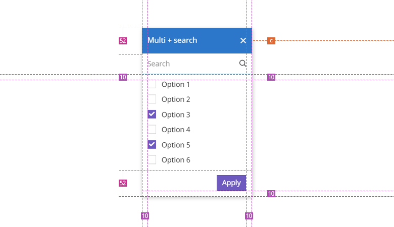
WUI decisions 
- Add filter. Via the add filter button the user gets a selection of all possible filters. The filters within this list are sorted by us according to their relevance. Filters that have already been selected will (in most cases) no longer appear in this list.
- Apply filters. Each filter has to be applied. Only after clicking
Applythe results will be updated. The button is initially disabled to avoid setting an empty filter. - Clear Selection. Well, it clears the selection and thus restores the initial state of the filter bar. The search is not affected by this.
- Search In a possible search, all options (selected/unselected) of the respective filter are searched. The search is displayed in case there are significantly more than 20 options expected. With approximately 20 options, it depends on the use case whether a search is needed. In this case, please contact the WUI team.
- Responsivness. The filter chips wrap to the next row as soon as they can no longer be displayed in one row.
- Closing a filter. If the user clicks on the x or outside the filter panel, the panel will be closed without applying the changes.
- Filter chip. Each filter can be removed separately. In addition, the user can click on the filter chip to show the respective filter predicate editor again in order to make changes here.
- Resorting filter options. For filters with more than 20 options, the selected and deselected options are kept in a staging state. When the filter is opened again, the selected options are sorted to the top (in alphabetical order). This way we can give the user a better overview of the selected options and also reduce frustration in case of accidental clicks.
Description
WuiVue's
<wui-filterbar>component is a flexible filterbar with built-in filter panels like single or multi-select or user input filters like number or text inputs. The filtbar also provides searchbar filter options if thesearchbarprop is set. Other features are support for options provider functions (remote search for filter options), slots for custom filter panels, and keyboard support.
Example: Basic usage
<template>
  <div>
    <wui-filterbar :filters="filters" @update="handleFilterUpdate" />
  </div>
</template>

<script>
  export default {
    data() {
      return {
        filters: [
          {
            // The key must be unique
            key: "status",
            // Translated label to display
            label: "Status",
            // Predicate editor config
            predicate: {
              // Multi-select filter (list of checkboxes)
              type: "MULTI_SELECT",
              // Here you define your options the user can choose from
              options: [
                { value: "DRAFT", text: "Draft" },
                { value: "PENDING", text: "Pending" },
              ],
              // Whether or not a comparison operator selectbox should be displayed
              // Boolean or String with operator category set (see section "Comparison operator types")
              // Possible operator types: "NUMERIC", "STRING_SHORT", "STRING_LONG"
              operator: true,
              // Displays a search input field at te top of the predicate editor
              // Usefull if you show many options
              searchbar: true,
            },
            // Whether or not the filter can be chosen only once or multiple times
            once: true,
          },
          {
            key: "creditor",
            label: "Creditor",
            predicate: {
              type: "MULTI_SELECT",
              // Options provider function
              options: this.creditorsOptionsProvider,
              // Will display a searchbar
              searchbar: true,
            },
            once: true,
          },
          {
            key: "creation_date",
            label: "Creation date",
            predicate: {
              // Singel select filter (list of radio buttons)
              type: "SINGLE_SELECT",
              options: [
                { text: "Last 7 days", value: "LAST_7_DAYS" },
                { text: "Last 30 days", value: "LAST_30_DAYS" },
                { text: "Last 90 days", value: "LAST_90_DAYS" },
              ],
            },
            once: true,
          },
          {
            key: "name",
            label: "Name",
            predicate: {
              // Renderst a text input field incl. select for string comparison operators
              type: "STRING",
            },
          },
          {
            key: "price",
            label: "Price",
            predicate: {
              // Renders an input field with currency symbol at the end
              // incl. select for numeric operators
              type: "MONEY",
              currencyCode: "EUR",
              currencySymbol: "€",
            },
          },
          {
            key: "number_of_items",
            label: "Number items",
            predicate: {
              // Renders an input field for numbers with currency symbol at the end
              // incl. select for numeric operators
              type: "NUMBER",
            },
          },
          {
            key: "filled_out_pc",
            label: "A value in %",
            predicate: {
              // Renders an input field for numbers with percentage symbol at the end
              // incl. select for numeric operators
              type: "PERCENT",
            },
          },
        ],
      };
    },
    methods: {
      async creditorsOptionsProvider() {
        await Promise.resolve([
          { value: "creditor_1", text: "Creditor 1" },
          { value: "creditor_2", text: "Creditor 2" },
        ]);
      },
      handleFilterUpdate(selectedFilters) {
        console.log("handleFilterUpdate, selectedFilters: ", selectedFilters);
      },
    },
  };
</script>

<!-- wui-filterbar.vue -->
Filters configuration
filters is the filters data in an array format, where each filter configuration is a filter category the user can choose. Example format:
const filters = [
  {
    // The key must be unique
    key: "status",
    // Translated label to display
    label: "Status",
    // Predicate editor config (the popup where the user can choose an option or enter custom values, see configuration options below)
    predicate: {},
    // Whether or not the filter can be chosen only once or multiple times
    once: true,
  },
];
<wui-filterbar> automatically samples the key props to extract filter nameslabels if no label prop is set. Filter names names are automatically "humanized" by converting kebab-case, snake_case, and camelCase to individual words and capitalizes each word. Example conversions:
buying_channelbecomesBuying Channelbuying-channelbecomesBuying ChannelstatusbecomesStatusPRICEremainsPRICEhasRestrictionsbecomesHas Restrictions
These filter names will be displayed in the filter suggest dropdown menu (in the order they appear in the filters array) and in the header of the predicate editor popup.
Predicate editor configuration
The predicate editor appears once the user selects a filter category from the filter suggest menu, or when she clicks on a filter chip with her selected filter options. The editor will be configured via the filter's property predicate.
Example configuration with all options
const predicate = {
  // Mandatory, possible options see below
  type: "MULTI_SELECT"
  // Only mandatory when 'type' is 'MULTI_SELECT' or 'SINGLE_SELECT', otherwise will be ignored
  // Can be an array or a function reference (see below)
  options: [
    {
      value: "DRAFT",
      text: "Draft"
    }
  ],
  // Optionally, you can customize the list item output by using a formatter callback function.
  // Only applicable if `type` is `SINGLE_SELECT` or `MULTI_SELECT`
  formatter: (text, value, option) => `${text} (insert_number_of_hits_here)})`
  // Whether or not the operator selectbox will be shown
  // Boolean or String with operator category set (see below)
  // Possible operator types: "NUMERIC", "STRING_SHORT", "STRING_LONG"
  operator: true,
  // Whether or not a search input field for searching filter options is shown in the predicate editor
  // Only available when 'type' is 'MULTI_SELECT' or 'SINGLE_SELECT', otherwise will be ignored
  searchbar: false
  // Only mandatory when 'type' is set to 'MONEY'
  currencyCode: "EUR",
  currencySymbol: "€",
}
Predicate editor types
The predicate.type property is mandatory, the following types are available:
Options based editors
SINGLE_SELECT- a list of options rendered as radio inputsMULTI_SELECT- a list of options rendered as checkbox inputs
User input based editors
STRING- renders a text input with string comparison operators selectboxNUMBER- renders a text input with numeric comparison operators selectboxMONEY- renders a text input with currency symbol at the end and a numeric comparison operators selectboxPERCENT- renders a text input with percentage symbol at the end and a numeric comparison operators selectbox
The biggest difference between option-based editor types and user input types is that with type SINGLE_SELECT or MULTI_SELECT you also have to pass the filter options via the options prop.
Filter options
There are two ways to provide filter options the user can choose from. Either by passing an array to the options prop or by passing a function reference (see "Using options provider function" below).
Because the filterbar uses wui-form-checkbox or wui-form-radio under the hood, all fields of the options array are supported:
valueThe selected value which will be set onv-modeldisabledDisables item for selectiontextDisplay text, orhtmlDisplay basic inline html
If both html and text are provided, html will take precedence. Only basic/native HTML is supported in the html field (components will not work, use scoped slots for that).
Example: options based filter using an Array
const options = [
  { value: "value_1", text: "Value 1" },
  { value: "value_2", text: "Value 2", disabled: true },
  { value: { v: "value_3" }, text: "Value 3" },
  { value: "value_4", html: "<strong>Value 4</strong>" },
];
If searchbar is set to true, a search input field is rendered and the user will be able to search for options in your predicate.options Array.
Infinite scrolling
With SINGLE_SELECT or MULTI_SELECT a maximum of 20 options are displayed. If more than 20 options are passed through, the predicate editor automatically activates infinite scrolling.
Example 1 - providing an array with 50 options
You have an array with 50 options:
const options = {
  options: [
    { value: "value_1", text: "Value 1" },
    //  ... all other 48 options go here
    { value: "value_50", text: "Value 50" },
  ],
};
Once the predicate editor opens, only the first 20 options are shown to the user (only 20 items are rendered in HTML). As soon as the user starts scrolling and gets to the end of the list, another 10 options from the already existing options array are rendered and displayed.
Example 2 - using a provider function
Instead of an array, you use a provider function, which returns an array of 1000 options.
const options = {
  options: (ctx) => {
    // Sample function that makes an API call and returns 1000 items
    // return [...1000 items]
  },
};
As in example 1, only the first 20 options are displayed here. As soon as the user starts scrolling and gets to the end of the list, another 10 options from the already existing array are displayed.
Note: the provider function is not called again on infinite scrolling as long as the predicate editor is open. The provider function is only called when the predicate editor opens or the user changes the search term.
Important note
The predicate.options array is not reactive by purpose, which means that later changes in the filters[].predicate.options object do not affect the display and status of filters and filter options in the filterbar. To provide reactive filter options, use an options provider function instead (see below).
Searching filter options
Filter options can be searched/filtered by the user if you set the prop predicate.searchbar of the desired filter to true. This will render a search input field in the predicate editor of the filter.
The built-in search has no effect if an options provider function is specified instead of an array of options. The entered query string by the user is passed to your provider function as a context parameter.
Optional placeholder text for searchbar
You can customize the value of the placeholder attribute by passing an Object instead of a Boolean via the searchbar prop:
const predicate: {
  type: "MULTI_SELECT",
  options: [{ value: "val_1", text: "Val 1" }],
  searchbar: {
    placeholder: "My custom placeholder text"
  }
}
Using options provider function
As mentioned, it is possible to use a function to provide the filter options, by specifying a function reference via the filters[].predicate.options prop.
The provider function is called with the following signature:
provider(ctx, [callback]);
The ctx is the context object associated with the filter's state, and contains the following properties:
| Property | Type | Description |
|---|---|---|
query | String | The search term the user has entered in the search input field (predicate.searchbar must be set to true) |
The second argument callback is an optional parameter for when using the callback asynchronous method.
Example: returning an array of filter options (synchronous):
function myProvider() {
  let items = [];

  // Perform any items processing needed

  // Must return an array
  return items || [];
}
Example: Using callback to return data (asynchronous):
function myProvider(ctx, callback) {
  const params = "?query=" + ctx.query;

  this.fetchData("/some/url" + params)
    .then((data) => {
      // Pluck the array of filter options off our axios response
      const options = data.options;
      // Provide the array of options to the callback
      callback(options);
    })
    .catch(() => {
      callback([]);
    });

  // Must return null or undefined to signal wui-filterbar that callback is being used
  return null;
}
Example: Using a Promise to return data (asynchronous):
function myProvider(ctx) {
  const promise = axios.get("/some/url?query=" + ctx.query);

  // Must return a promise that resolves to an array of filter options
  return promise.then((data) => {
    // Pluck the array of options off our axios response
    const options = data.options;
    // Must return an array of options or an empty array if an error occurred
    return options || [];
  });
}
Example: Using an async function (semi-synchronous):
async function myProvider(ctx) {
  try {
    const response = await axios.get(`/some/url?query=${ctx.query}`);
    return response.items;
  } catch (error) {
    return [];
  }
}
Note: The options provider function is called every time the predicate editor opens.
Options provider filtering
By default, the options provider function is responsible for filtering the data, before passing it to the predicate editor for display.
The provider function is triggered as soon as the predicate editor gets mounted (usually when displayed to the user) as well as soon as the user enters a term in the search field in the predicate editor (predicate.searchbar must be set to true).
Comparison operator types
With the predicate parameter operator you can give users more options when filtering. If operator is set to true, a selectbox with pre-configured comparison operator choices for each filter type is displayed. The following comparison operators are available:
// Default for all numeric predicate editors ('NUMBER', 'MONEY', 'PERCENT')
const NUMERIC = [
  "GREATER_THAN",
  "GREATER_THAN_OR_EQUAL",
  "EQUAL",
  "UNEQUAL",
  "LESS_THAN",
  "LESS_THAN_OR_EQUAL",
];

// Default for 'STRING' predicate editor
const STRING_LONG = [
  "CONTAINS",
  "CONTAINS_NOT",
  "CONTAINS_CASE_SENSITIVE",
  "CONTAINS_NOT_CASE_SENSITIVE",
  "EQUALS",
  "STARTS_WITH",
];

// Onyl default for 'SINGLE_SELECT' and 'MULTI_SELECT' predicate editors when 'operator' is set to 'true', otherwhise no operator selectbox is rendered
const STRING_SHORT = ["CONTAINS", "CONTAINS_NOT"];
You can also specify one of the available operator categories to render a predefined set of operators.
Example filter configuration with a custom set comparison operator category
const filters = [
 {
   key: "status",
   label: "Status",
   predicate: {
     type: "MULTI_SELECT",
     options: [
       { value: "DRAFT", "Draft" },
       { value: "PENDING", "Pending" }
     ],
     // Will render a selectbox with a list of string based comparison operators (6 in total, see above)
     operator: "STRING_LONG"
   }
 }
]
For user-input-based predicate editors (predicate.type is set to NUMBER, MONEY, PERCENT and STRING), the operator selection is shown by default. You can hide the selectbox by setting operator to false.
Custom predicate editor
A custom predicate editor for each filter category is possible using scoped slots.
Scoped predicate editor slots
Scoped predicate editor slots give you the opportunity to build your own custom predicate editor for a particular filter. Scoped predicate editor slots use the following naming syntax: 'predicate(' + filter key + ')'.
Example: Custom predicate editor rendering with scoped slots
<template>
  <div>
    <wui-filterbar :filters="filters">
      <template #predicate(status)="{ predicate }">
        <strong>Your custom predicate editor for 'status' filter goes here.<strong><br />
        <button @click="predicate.updateModel([{ value: 'DRAFT_TEST', text: 'Draft Test' }])">
          Submit
        </button>
        Scoped props: <pre>{ predicate }</pre>
      </template>
    </wui-filterbar>
  </div>
</template>

<script>
  export default {
    data() {
      return {
        filters: [
          {
            key: "status",
            label: "Status",
            predicate: {
              // Type is still mandatory
              type: "MULTI_SELECT",
              options: [
                { value: "DRAFT", text: "Draft" },
                { value: "PENDING", text: "Pending" },
              ],
            },
            once: true,
          },
        ],
      };
    },
  };
</script>

<!-- wui-filterbar-slots.vue -->
Example 2: Custom predicate editor - filter by restrictions
<template>
  <div>
    <wui-filterbar :filters="filters">
      <!-- We render our custom radio buttons in the `predicate-before(restrictions)` slot -->
      <!-- This slot has no overflow-y scroll -->
      <template #predicate-before(restrictions)="{ predicate }">
        <wui-form validated="state" class="border-b-1 p-x-15 p-y-10">
          <wui-form-group v-slot="{ ariaDescribedby }" class="m-b-0">
            <wui-form-radio-group
              id="hasRestriction"
              :aria-describedby="ariaDescribedby"
              name="hasRestriction"
              :checked="predicate.localModel"
              stacked
              @input="handleRestrictonsInput($event, predicate)"
            >
              <wui-form-radio
                key="with_restrictions"
                :value="[
                  {
                    value: 'with_restrictions',
                    text: 'Has country restrictions',
                  },
                ]"
                class="m-t-0"
                >Has country restrictions</wui-form-radio
              >
              <wui-form-radio
                key="without_restrictions"
                :value="[
                  {
                    value: 'without_restrictions',
                    text: 'Has no country restrictions',
                  },
                ]"
                class="m-b-0"
                >Has no country restrictions</wui-form-radio
              >
            </wui-form-radio-group>
          </wui-form-group>
        </wui-form>
      </template>
      <!-- Here we render the checkbox list of our filter options in the dedicated scoped slot `predicate(restrictions)` -->
      <!-- This list has `overflow-y: scoll` set -->
      <template #predicate(restrictions)="{ predicate }">
        <!-- We use the `wui-filter-editor-list` component here to have more control over the input events and the behaviour in conjunction with the radio buttons above -->
        <!-- The `getFilteredOptions` function filters out the values set by once of the radios above. Otherwise the editor list would render an addintional checkbox at the top with the value of one of the radios. -->
        <wui-filter-editor-list
          ref="editor-input"
          name="restrictions"
          :options="getFilteredOptions(predicate.filteredOptions)"
          type="MULTI_SELECT"
          :state="predicate.validationState"
          :errorMessage="predicate.errorMessage"
          :checked="predicate.localModel"
          @input="handleRestrictonsInput($event, predicate)"
        >
          <template #before>
            <p class="p-y-10">Or should match with:</p>
          </template>
        </wui-filter-editor-list>
      </template>
    </wui-filterbar>
  </div>
</template>

<script>
  const isEmptyArray = (value) =>
    !Boolean(Array.isArray(value) && value.length);

  export default {
    computed: {
      filters() {
        return [
          {
            key: "restrictions",
            label: "Restrictions by country",
            predicate: {
              type: "MULTI_SELECT",
              options: this.countriesOptionsProvider,
            },
            once: true,
          },
        ];
      },
    },
    methods: {
      // Our custom filter options provider function
      // Is called everytime the predicate editor opens, or
      // when the user enters a search term (only when `predicate.searchable` is set to `true`)
      async countriesOptionsProvider() {
        return await Promise.resolve(
          [
            { count: 2, text: "BE", value: "BE" },
            { count: 13710, text: "CH", value: "CH" },
            { count: 31343, text: "DE", value: "DE" },
          ].map((res) => ({
            value: res.value,
            text: `${res.text} (${res.count})`,
          }))
        );
      },
      // Remove custom filter options "with_restrictions" and "without_restrictions"
      // to prevent the rendering of an additional checkbox (because by default the predicate editor renders all selected options at the top of the list)
      getFilteredOptions(filteredOptions) {
        return filteredOptions.filter(
          (option) =>
            !["with_restrictions", "without_restrictions"].includes(
              get(option, "value.value", "")
            )
        );
      },
      // Our custom logic to handle user inputs whether from our custom radios
      // or from the checkbox list below
      // @values: Array with the current selected options
      // @predicate: the object from the scoped slot which contains the `updateModel` function we need to call
      handleRestrictonsInput(values, predicate) {
        if (isEmptyArray(values)) {
          return;
        }

        // Store the custom value object from one of our radio options
        const withOrWithoutRestrictionsObject = values.find(
          (res) =>
            res &&
            (get(res, "value") === "with_restrictions" ||
              get(res, "value") === "without_restrictions")
        );

        // Store the String "with_restrictions" or "without_restrictions"
        const withOrWithoutRestrictionsValue = get(
          withOrWithoutRestrictionsObject,
          "value"
        );

        // If either "with_restrictions" or "without_restrictions" is set
        // we update the model with the value from the radio button only.
        // This will overwrite any existing selected options from the checkbox list and
        // automatically uncheck all checkbox options.
        if (values.length === 1 && withOrWithoutRestrictionsValue) {
          predicate.updateModel([withOrWithoutRestrictionsObject]);
        } else {
          // The `values` Array contains at least one item from the checkbox list.
          // We filter out any set values from our custom radio buttons which automatically
          // makes them unselected.
          predicate.updateModel(
            values.filter(
              (option) =>
                !["with_restrictions", "without_restrictions"].includes(
                  get(option, "value", "")
                )
            )
          );
        }
      },
    },
  };
</script>

<!-- wui-filterbar-custom-predicate-editor.vue -->
The slot's scope variable (predicate in the above sample) will have the following properties:
| Property | Type | Description |
|---|---|---|
errorMessage | String | The error message from the filter-predicate-editor component |
filteredOptions | Array | A filtered list of your provided options (when type is set to MULTI_SELECT) where all the selected options are put at the beginning of the list to display them first before all other options. |
id | String | The unique id of the filter given by the filterbar |
isTemporary | Boolean | Whether or not this predicate editor belongs to a new selected filter. Useful if you need to distinguish between a new filter which the user is about to create and an existing filter the user wants to modify |
key | String | The filter key from your configuration (status in the above example) |
label | String | The translated filter name you have passed via the filters config |
localModelv-model | Array | The current selected options or the current entered value by the user. User the updateModel() scoped function to update the v-model |
operator | String | The value of the current selected operator |
query | String | The user's text input of the search input field if you have set searchbar prop in your filter's config to true. In that case a search input is rendered above and outside of the slot content |
resetModel() | Function | Function which resets the model to [] |
selected | Array | The filter's current and confirmed selected filter options or the filter value entered by the user. The value gets updated when the user clicks the confirmation button in the predicate editor |
type | String | The filter type |
updateModel([]) | Function | Function to update the v-model prop localModel. Function parameter musst be an Array of one or more values. If MULTI_SELECT or SINGLE_SELECT is set, the value must be an Array of objects in the form of [{ value: "DRAFT", text: "Draft" }] |
updateOperator({operator}) | Function | Function to update the operator prop. Must be one of the available comparison operator values |
updateQuery() | Function | Function to update the search query prop |
validationState() | Boolean or undefined | The current validation state of the predicate editor. If false, there is an error (e.g. user needs to choose at least one options), true if entered user data or chosen option is valid, or undefined (default state when predicate editor just opened for the first time with no set filter) |
Example: Custom predicate option items rendering with editor-option-item scoped slot
<template>
  <div>
    <wui-filterbar :filters="filters">
      <template #predicate-option-item(display_creator.id)="{ predicate }">
        <div
          class="display--flex align-items-center w-full text--left p-x-10 p-y-5"
        >
          <div class="flex-shrink-0" style="width: 15px">
            <wui-fa-icon
              v-if="predicate.optionItem.checked"
              :icon="['far', 'check']"
            />
          </div>
          <div class="flex-shrink-0 m-l-10">
            <img
              v-if="predicate.optionItem.image"
              class="img-circle"
              :src="predicate.optionItem.image"
              :alt="predicate.optionItem.text"
              style="width: 30px; height: 30px"
            />
            <user-image
              v-else
              :id="predicate.optionItem.value"
              class="img-circle"
              :alt="predicate.optionItem.text"
              style="width: 30px; height: 30px"
            />
          </div>
          <div class="flex-grow-1 m-l-10">{ predicate.optionItem.text }</div>
        </div>
      </template>
    </wui-filterbar>
  </div>
</template>

<script>
  const creators = [
    {
      value: "bb463b8b-b76c-4f6a-9726-65ab5730b69b",
      text: "Ron Dare",
      image:
        "https://cloudflare-ipfs.com/ipfs/Qmd3W5DuhgHirLHGVixi6V76LhCkZUz6pnFt5AJBiyvHye/avatar/104.jpg",
    },
    {
      value: "8b86a4d7-bb95-4b65-a553-34fac1c60627",
      text: "Jerry Hahn PhD",
      image:
        "https://cloudflare-ipfs.com/ipfs/Qmd3W5DuhgHirLHGVixi6V76LhCkZUz6pnFt5AJBiyvHye/avatar/532.jpg",
    },
    {
      value: "cebf8879-9145-476a-9e41-77f3869c17dc",
      text: "Johnnie Kemmer",
      image:
        "https://cloudflare-ipfs.com/ipfs/Qmd3W5DuhgHirLHGVixi6V76LhCkZUz6pnFt5AJBiyvHye/avatar/428.jpg",
    },
    {
      value: "0456bade-487a-449d-94a8-d215ce323793",
      text: "Miss Rochelle Cronin",
      image:
        "https://cloudflare-ipfs.com/ipfs/Qmd3W5DuhgHirLHGVixi6V76LhCkZUz6pnFt5AJBiyvHye/avatar/1148.jpg",
    },
  ];

  const UserImage = {
    props: {
      id: {
        type: [String, Number],
        required: true,
      },
    },
    data() {
      return {
        imageSrc: "",
      };
    },
    created() {
      this.getLink();
    },
    methods: {
      async getLink() {
        try {
          const creator = creators.find((creator) => creator.value === this.id)
          this.imageSrc = creator.image;
        } catch (error) {
          // eslint-disable-next-line no-console
          console.error("Error while finding creator by id: ", this.id);
          return "";
        }
      },
    },
    render(h) {
      return this.imageSrc ? h("img", { attrs: { src: this.imageSrc } }) : h();
    },
  };

  export default {
    components: {
      UserImage,
    },
    data() {
      filters: [
        {
          key: "creator",
          label: "Creator",
          predicate: {
            // Type is still mandatory
            type: "MULTI_SELECT",
            options: creators,
          },
          once: true,
        },
      ],
    },
  };
</script>

<!-- wui-filterbar-custom-option-items-scoped-slot.vue -->
The slot's scope variable (predicate in the above sample) will have the additional property optionItem amongst all the other previously mentioned props. The scope of optionItem is:
| Property | Type | Description |
|---|---|---|
option | Object | the current option item (will have text value from the formatter function if provided) |
checked | Boolean | wheather or not the current item is checked) |
[... allOtherOptions] | All other options you have provided by the predicate.options array will be passed |
Force refreshing of filterbar
You may also trigger the refresh of the filters configuration and selected filters by calling the refresh() method on the filterbar reference
<div>
  <wui-filterbar ref="filterbar" ...></wui-filterbar>
</div>
this.$refs.filterbar.refresh();
Note: The refresh() method resets all filters already selected by the user. Furthermore, the props filters and initialSelected are read and set again. You should update these props before you call the refresh() method in case you want to provide a new filters configuration or initial selected filters.
Initial selected filter options
If you want the filter bar to show pre-selected filter options during initialization, you can pass the filters and set values with the initialSelected prop. Either as an Array or as a Function that returns an Array.
If a function is used, the Filterbar UI only becomes interactive once a result has been returned. During the loading process, the filter bar is in a "busy" state and only an empty box with no content is displayed.
Example using an Array
const initialSelected = [
  {
    key: "status",
    value: [
      { value: "DRAFT", text: "Draft" },
      { value: "PENDING", text: "Pending" },
    ],
  },
];
Example using an asynchronous function
async function getInitialSelected() {
  try {
    const response = await axios.get("/some/url");
    // Musst return an Array with one or more objects with the same Array shape as in the example above
    return response.items;
  } catch (error) {
    return [];
  }
}

const initialSelected = this.getInitialSelected;
Note: Initially set filters are only displayed if there is a corresponding filter configuration for key in the filters prop. In the examples above, there must be a filter configuration for status.
Component reference
<wui-filterbar>
Properties
| Property | Type | Default | Description |
|---|---|---|---|
filters | Array | [] | Array of filter configurations |
hide-filter-toolbar | Boolean | false | Whether or not the toolbelt-bar wrapper component for the filter bar should be hidden. Use this in cunjunction with the 'toolbelt-bar' slot to display another toolbelt bar |
initial-selected | Array or Function | [] | Initial selected filters to display (no v-model support). Format [{ key: 'filter_category_key', value: { value: 'SELECTED_VALUE', text: 'TEXT_TO_DISPLAY' } }] or a function reference |
inline | Boolean | true | Whether or not the filterbar is in inline mode |
predicates-items-tag | String | LI | HTML tag of the filter predicates item element |
predicates-wrapper-tag | String | UL | HTML tag of the filter predicates wrapper element |
translations | Object | see translations.js | The translation object to pass custom texts |
toolbelt-props | Object | {} | Props to pass to the wui-toolbelt component which is the wrapper for the filterbar |
Slots
| Name | Scoped | Description |
|---|---|---|
predicate({key}) | Yes (see "Scoped predicate editor slots" section) | Scoped slot for custom predicate editor rendering. '{key}' is the filter's key name. See docs for scoped data |
predicate-after({key}) | Yes (see "Scoped predicate editor slots" section) | Content to place after the user input (or options list) in the predicate editor. '{key}' is the filter's key name. See docs for scoped data |
predicate-before({key}) | Yes (see "Scoped predicate editor slots" section) | Content to place before the user input (or options list), but after the operator and search input in the predicate editor. '{key}' is the filter's key name. See docs for scoped data |
predicate-option-item({key}) | Yes (see "Scoped predicate editor slots" section) | Scoped slot for content to place for each list item. Includes optionItem as an additional child property of the predicate scoped prop object with { value: 'option_item_value', text: 'Option item text', checked: true/false, ...allOtherOptionItemProps }. Only applicable if the filter's predicate.type is SINGLE_SELECT or MULTI_SELECT |
predicate-top({key}) | Yes (see "Scoped predicate editor slots" section) | Content to place at the top of the predicate editor, above the operator and search input. '{key}' is the filter's key name. See docs for scoped data |
toolbelt-bar | No | Another toolbelt-bar to place next to the filter toolbelt-bar. Use this slot in cunjunction with the 'hideFilterToolbar' prop |
Events
| Event | Arguments | Description |
|---|---|---|
input | [{ value, operator, key, id}] - Array of objects. Object contains the predicator's id, the filter key and the value Array of objects. Structure: [{ id: '', key: '', value: [{ value: '', text: '' }] }] | Emitted when a value inside of a predicate editor changes by user interaction |
update | [{ key: '', operator: '', value: [] }] - Array of objects containing the selected filters. value is always an Array | Emitted when a new filter has been set and confirmed (user has clicked on 'Apply' in the predicate editor) by the user. |
<wui-filterbar-menu-suggest-input>
Component aliases
<wui-filterbar-menu-suggest-input> can also be used via the following aliases:
<wui-filter-menu-suggest-input><wui-filter-menu-suggest><wui-filter-suggest-input>
Note: component aliases are only available when importing all of WuiVue or using the component group plugin.
Properties
| Property | Type | Default | Description |
|---|---|---|---|
dialogVisible | Boolean | false | Whether or not the dialog is open (visible) |
items | Array | [] | The menu options to display in the dialog |
role | String | row | The value for the HTML role attribute |
searchbar | Boolean | true | Whether or not a form text input should be rendered at the top of the dialog and users are able to search for menu items |
tag | String | DIV | The HTML tag of the component's wrapper element |
showButton | Boolean | true | Whether or not a button should be rendered instead of just showing the input's placeholder text |
translations | Object | see translations.js | The translation object to pass custom texts |
v-model
| Property | Event |
|---|---|
dialogVisible | change |
Events
| Event | Arguments | Description |
|---|---|---|
change | dialogVisible - Boolean The new boolean state of dialogVisible | Emitted to update the dialogVisible v-model. Emmitted everytime the user has made an input, hits ENTER or ESC. |
menu-hide | Emitted when the dialog menu is starting to hide, before the CSS transition starts | |
menu-hidden | Emitted when the dialog menu is hidden, after the CSS transition has finished | |
menu-show | Emitted when the dialog menu is starting to show, before the CSS transition starts | |
menu-shown | Emitted when the dialog menu is shown, after the CSS transition has finished | |
selected | value - String - The value of the menu option the user has chosenevent - [MouseEvent, KeyboardEvent] - The native event which triggered the selection, either click or keydown.enter | Emitted when the user selects an option from the dialog menu |
Importing individual components
You can import individual components into your project via the following named exports:
| Component | Named Export |
|---|---|
<wui-filterbar> | WuiFilterbar |
<wui-filter-menu-suggest-input> | WuiFilterbarMenuSuggestInput |
Example
import { WuiFilterbar } from "@wui/wui-vue/lib/filterbar";
Vue.component("wui-filterbar", WuiFilterbar);
Importing as a Vue.js plugin
This plugin includes all of the above listed individual components. Plugins also include any component aliases.
| Named Export | Import Path |
|---|---|
FilterbarPlugin | @wui/wui-vue/lib/filterbar |
Example
import { FilterbarPlugin } from "@wui/wui-vue/lib/filterbar";
Vue.use(FilterbarPlugin);

