Example
<div class="display--flex justify-content-center">
  <wui-timepicker
    :show-second="false"
    :time-picker-options="{ start: '00:00', step: '00:15', end: '23:59' }"
    placeholder="hh:mm A"
  />
</div>
Usage
We use two different variants of the time picker. Which one we use depends on what kind of input we expect.
For example, when the user creates an appointment, we expect an input on a quarter or half-hour basis. (use timepicker simple)
However, to search for a specific log entry, the user sometimes needs to specify the time on a second basis. (use timepicker precise)
Related pages
Storybook: Timepicker simple
Storybook: Timepicker precise
Anatomy
Timepicker simple (default)
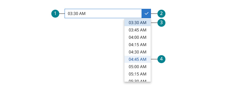
The timepicker simple is our default. From a cognitive point of view, the dropdown is very fast to grasp. By default, the options are in quarter-hourly intervals, which is suitable for most of our use cases.

- Input field. The user can write or paste a time directly, even if the specific time is not included in the options from the dropdown.
- wui-input-group__append. When the timepicker is focused, the append gets the $color-active, and the clock icon becomes
fa-regular fa-check. - selected-state The selected option always moves to the top.
BG-color: $color-active-20 / Font-color: $color-active-70 - hover-state. BG-color: $color-active-10 / Font-color: $color-active-60
Timepicker precise
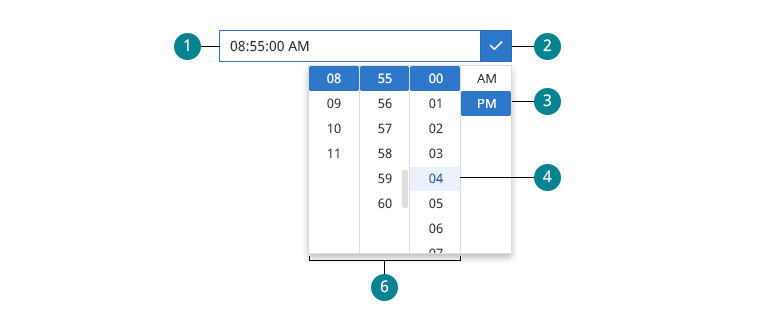
The timepicker precise is always used when it is necessary to determine an exact point in time. For example, when searching for a specific log entry, it can be essential to specify hours and minutes and seconds.

- Input field. The user can write or paste a time directly, even if the specific time is not included in the options from the dropdown.
- wui-input-group__append. When the timepicker is focused, the append gets the $color-active, and the clock icon becomes
fa-regular fa-check. - AM/PM selector. Both values are always visible. Unlike the other columns, the selected value does not move to the top.
- hover-state. BG-color: $color-active-10 / Font-color: $color-active-60
- Hours / minutes / seconds. The selected value moves to the top. BG-color: $color-active
WUI decisions 
- Time and date. When the user needs to choose time and a date, we will handle that with two independent input fields. The possible further specification of a time zone would also be another independent input field.
- Interval options. Even though there are various interval options for the timepicker
simple, we usually use the quarter-hour options. - Smart autoformatting. When the user makes an input, it is automatically formatted according to their localization. We deliberately do not use masking of input fields because this method has some disadvantages, especially when it comes to fast copy and paste.
- Localization. The timepicker is related to the language of the user. (e.g. a German user has the 24-hour clock, an American user has the AM/PM abbreviation.)
The
<wui-timepicker>is wrapper component built on top ofvue2-datepickerplugin. It extends plugin functionality to fit WeScale requirements regarding functionality and style guide.
Description
<wui-timepicker> is component used to display timepicker to user. It consists of input group (input and trigger button) and time picker panels, with options to override default slots. To set time bind value via v-model. Component accepts many props to customize plugin based on developer needs.
<wui-timepicker
  v-model="value"
  locale="en-US"
  format="hh:mm A"
  placeholder="hh:mm A"
/>

export default { data() { return { value: new Date(), }; }, }
v-model binding
If you bind a variable to the v-model prop, the contents of this variable will be the currently selected time. v-model value type depends on prop valueType default value type is JS date object.
Value type
Developers can set the format of binding value with prop valueType. Default is "date", other available options are:
| Value | Description |
|---|---|
| "date" | return a Date object |
| "timestamp" | return a timestamp number |
| "format" | returns a string formatted using pattern of format |
| token(MM/DD/YYYY) | returns a string formatted using this pattern |
<wui-timepicker value-type="timestamp" v-model="new Date().getTime()" />
Plugin type
There are two display types, default simple and precise. Developers can change type with displayType property.
When using simple timepicker display type developer can set multiple options like format and timePickerOptions with start, step and end values that define plugin panel display.
Difference between precise and simple options is that simple option will display all time units in one panel/column while precise will have many columns depending on format.
<wui-timepicker
  display-type="simple"
  format="hh:mm A"
  placeholder="hh:mm A"
  :time-picker-options="{ step: '00:15' }"
/>
Locale
Use locale property to set user locale for timepicker formatting settings. Default locale is en-US.
Datepicker supports all locales that are supported by old datepicker plugin and by WeScale IntlJS.
All locale options contain values required by timepicker plugin.
<wui-timepicker locale="de-DE" />
Relevant properties for timepicker are included in locale object. Example for de-DE:
{
  ...
  use12h: false,
  timeFormat: 'HH:mm:ss',
  ...
}
use12h
Default value for use12h is set automatically from locale settings object.
It's important to note that use12h is prop from vue2-datepicker plugin and it will hide/show AM-PM column and display 24 hour column in "precise" type of timepicker!
Timezone
Timepicker will always output time as JavaScript Date object in user locale timezone. To change timezone developers modify JS Date object or can create new select component with timezones and use selection value to change timezone.
Formatting
Developers can set custom time formatting for input element using time tokens. Users can type in, or paste text in defined format. If format property is not defined then default formatting will be locale format.
<wui-timepicker format="hh:mm A" placeholder="hh:mm A" />
| Unit | Token | Output |
|---|---|---|
| AM/PM | A | AM PM |
| a | am pm | |
| Hour | H | 0 1 ... 22 23 |
| HH | 00 01 ... 22 23 | |
| h | 1 2 ... 12 | |
| hh | 01 02 ... 12 | |
| Minute | m | 0 1 ... 58 59 |
| mm | 00 01 ... 58 59 | |
| Second | s | 0 1 ... 58 59 |
| ss | 00 01 ... 58 59 | |
| Fractional Second | S | 0 1 ... 8 9 |
| SS | 00 01 ... 98 99 | |
| SSS | 000 001 ... 998 999 | |
| Time Zone | Z | -07:00 -06:00 ... +06:00 +07:00 |
| ZZ | -0700 -0600 ... +0600 +0700 | |
| Unix Timestamp | X | 1360013296 |
| Unix Millisecond Timestamp | x | 1360013296123 |
User input
User can type in, or paste text in input element, and if that value is in correct user locale format it will be displayed in timepicker. e.g. user locale is de-DE user can type in or paste in value e.g. 16:21:38. In case when input value is in different format from user locale plugin will simply ignore that value.
Set time
Use v-model property to set time. Accepted value depends on valueType prop, default is JavaScript date object.
<wui-timepicker :v-model="value" format="HH:mm:ss" />

export default { data() { return { value: new Date('2022-06-21T12:00:00Z'), };
}, }
Hide selection options
To hide specific column for precise timepicker use available properties showHour, showMinute and showSecond.
Default display depends on format prop, but it will be overridden if one of the above mentioned props are used.
It's important to understand that if format prop is used with for example showSecond, it will only hide seconds column when displayType: 'precise' is used, and input value will match format. For displayType: simple format has precedence over showSecond i.e. if format is hh:mm:ss A then seconds will be displayed in selection even if showSecond: false.
<wui-timepicker :v-model="value" :show-second="false" />
Hour, minute and second steps
Timepicker has two option to set allowed hour, minute and second steps for selection.
For simple displayType developers can set custom time picker options with timePickerOptions property:
<wui-timepicker
  display-type="simple"
  format="hh:mm A"
  placeholder="hh:mm A"
  :time-picker-options="{ start: '01:15', step: '00:15', end: '19:45' }"
/>
For precise displayType developers can use hourStep, minuteStep and secondStep properties:
<wui-timepicker :minute-step="15" :disabled-time="date => date < new Date()" />
Disable time
To disable specific time selection use disabledTime property. It's function with date argument that should compare every value from timepicker with custom JavaScript date object.
For example allow only future time selection:
<wui-timepicker
  format="hh:mm A"
  placeholder="hh:mm A"
  :disabled-time="date => date < new Date()"
/>
Component reference
<wui-timepicker>
<wui-timepicker>Properties<wui-timepicker>Events<wui-timepicker>Slots
Properties
| Property | Type | Default | Description |
|---|---|---|---|
valueType | String | date | Data type of the binding value |
locale | String | "en-US" | Set value for user locale |
displayType | String | "simple" | Use simple or precise timepicker layout |
format | String | Based on locale property | Set specific input value format using Formatting tokens |
hourStep | Number | 1 | Set available selection options for hours when using "precise" timepicker displayType |
minuteStep | Number | 1 | Set available selection options for minute steps when using "precise" timepicker displayType |
secondStep | Number | 1 | Set available selection options for second when using "precise" timepicker displayType |
hourOptions | Array | Array<number> | Custom hour column |
minuteOptions | Array | Array<number> | Custom minute column |
secondOptions | Array | Array<number> | Custom second column |
showHour | Boolean | base on format | Show hour column |
showMinute | Boolean | base on format | Show minute column |
showSecond | Boolean | base on format | Show second column |
timePickerOptions | Object | { start: '00:00', step: '00:01', end: '23:59' } | Set "simple" timepicker options, as in section Minute steps |
disabledTime | Function | (date: Date) => boolean | Specify the time that cannot be selected |
use12h | Boolean | Defaults to locale settings, check use12h | Display AM / PM and 24 / 12 hours timepicker panel for "precise" timepicker displayType |
open | Boolean | false | Set initial visibility for timepicker panel |
inline | Boolean | false | Display inline timepicker |
disabled | Boolean | false | Use to disable input and calendar |
placeholder | String | "" | Set input element placeholder attribute |
editable | Boolean | false | Set input element to readonly i.e. disable user input |
customPopupClass | String | "" | Set popup element class |
inputClass | String | "" | Set input element class |
inputAttr | Object | null | Set input element attributes eg: { name: 'input-name', id: 'input-id'} |
scrollDuration | Number | 100 | Set the duration of scroll when hour is selected |
Events
| Event | Arguments | Description |
|---|---|---|
input | date | When the value change (v-model event) |
change | date, type('date','hour','minute','second','ampm') | When the value change (same as input) |
open | When panel opening | |
close | When panel closing | |
focus | When input focus | |
blur | When input blur | |
pick | date | When date is selected |
Slots
| Name | Scoped | Description |
|---|---|---|
input | Yes (see package.json) | Replace input |
header | Yes (see package.json) | Popup header |
footer | Yes (see package.json) | Popup footer |
sidebar | Yes (see package.json) | Popup sidebar |

